|
|
Banner.
Sept 25, 2008 11:16:59 GMT -5
Post by Inah on Sept 25, 2008 11:16:59 GMT -5
I just wanted to know what people think of it. Constructive criticisms are very welcome as well because I want to improve.
|
|
|
|
Banner.
Sept 25, 2008 11:20:24 GMT -5
Post by .::Affliction ©::. on Sept 25, 2008 11:20:24 GMT -5
Very creative work, 9/10
|
|
|
|
Banner.
Sept 25, 2008 11:21:23 GMT -5
Post by hOvA on Sept 25, 2008 11:21:23 GMT -5
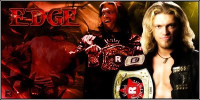
Wel I liked it so much I gave Inah karma. Seriously, the young wrestlers fit in with the theme of The Rebirth and the fading between the arena and the moves being executed is done very nicely. The text is very cool too, probably my favourite part of the banner. Overall, an excellant job by you Inah.
|
|
|
|
Banner.
Sept 25, 2008 12:03:32 GMT -5
Post by Inah on Sept 25, 2008 12:03:32 GMT -5
Thanks Affy and Al.
|
|
|
|
Banner.
Sept 25, 2008 13:24:18 GMT -5
Post by ladymahogany on Sept 25, 2008 13:24:18 GMT -5
If you mean the site banner, it's excellent. I love the lighting contrast from left to right.
|
|
|
|
Banner.
Sept 25, 2008 13:27:35 GMT -5
Post by Inah on Sept 25, 2008 13:27:35 GMT -5
If you mean the site banner, it's excellent. I love the lighting contrast from left to right. Thank you LM. This means a lot coming from a GFX maker like you. |
|
Fade
Development
Posts: 43
|
Banner.
Sept 25, 2008 16:56:49 GMT -5
Post by Fade on Sept 25, 2008 16:56:49 GMT -5
Its too dark.
|
|
|
|
Banner.
Sept 26, 2008 10:44:45 GMT -5
Post by Inah on Sept 26, 2008 10:44:45 GMT -5
What do you mean? Like the whole banner or just some parts? |
|
tic
Development
Posts: 36
|
Banner.
Sept 26, 2008 17:03:08 GMT -5
Post by tic on Sept 26, 2008 17:03:08 GMT -5
I Love it, great job
|
|
Fade
Development
Posts: 43
|
Banner.
Sept 27, 2008 14:14:28 GMT -5
Post by Fade on Sept 27, 2008 14:14:28 GMT -5
What do you mean? Like the whole banner or just some parts? I mean what I said, its too dark. If you made the render's lighter, it'd be a big improvement. |
|